
A brand new integration & runtime monitoring experience to reduce support dependency.
Integrated Observability & Monitoring into IBM App Connect SaaS, enabling users to assess integration health, optimise runtimes, and enhance performance of their system; saving them time and money.
Top 5 skills utilised
Project overview
August 2023 - March 2024
Aligning on the problem & scoping
I led a 3-day workshop to align on the problem space and scope the work appropriately, supported by an illustration I created to build empathy with the user challenges.
The user problem illustrated
This illustration I created highlights the core user problem; without visibility, monitoring and alerts, Isaac, our integration developer, had to rely on support tickets or manual log checks to detect issues. This impacted his ability to respond in such a way that customer impact was minimised and increased strain on support.

Kick off workshop
I ran a fast-paced, cross-disciplinary design workshop to explore key opportunity areas, rapidly ideate on solutions, and align early with stakeholders. The outputs formed a strong foundation for user testing the following week; shaping priorities based on real insights. This section covers a detailed view of the workshop and what the outcomes were; although the images provided are of the Mural translations of the workshop, this was held in person over 3 days.

Day 1: Gather requirements & identify opportunities
On this day, we aligned on user needs, gathered existing research, and mapped out key pain points across user journeys. We clarified assumptions, determined opportunity areas, and began initial scoping based on insights and SME input.


Day 2: Ideation & creative thinking
We transformed pain points and opportunities into solutions through structured ideation; using "How Might We...?"s (HMWs), Crazy Eights, and Round Robin techniques. By the end of the day, we had a broad range of creative ideas as well as a set of individual solution concepts ready for further refinement.


Day 3: Rapid prototyping & playbacks
We consolidated and prioritised our strongest ideas, created a compelling end-to-end story, and aligned the wider team through a final playback. This capped off the workshop with a clear direction for the experience; particularly the areas we needed to test to de-risk the project.


User testing
I ran 6 usability tests on low-fidelity Figma prototypes for integration monitoring and uncovered key needs around role-based workflows, clear homepage alerts, and threshold-based notifications. These insights led us to split delivery into two phases, with phase 2 deemed essential to meet core user needs and truly deliver an MVP.

User testing summary
Participants:
6 individuals responsible monitoring integrations at their companies. These were spread across different sized companies; from small-medium businesses to large enterprises.
Format:
Combined exploratory interviews and prototype testing. We had 2 observer slots available for each session so design, engineering and PM had the opportunity to listen to the feedback live.
Approach:
Started with broad questions about existing tools, error-handling processes and pain points. Then tested 3 low-fidelity prototypes to evaluate core value.
Prototypes:
The 3 prototypes covered how we might initially notify the user of errors to a series of charts, graphs and tables displaying what we perceived as key data. I put together the bulk of the prototypes with our new intern supporting on chart creation to get UX experience.
Key insights
I've collated the top 4 insights that impacted the direction of the project.


Outcomes & impacts
Ideation on phase 1
Here are the key design proposals for phase 1.
Key features
Here are some examples of the early designs and how they addressed the key experience issues identified earlier.


Restrictions & Solutions throughout the ideation phase
Restriction 1
Initial engineering spikes revealed the feature set was more complex than expected, leading to significant scope reduction. As a result, only the dashboard and runtime drill-down pages, focused on runtime data via charts and tables without errors or the summary widget, were feasible for delivery in Phase 1.
Solution
To adapt, we streamlined designs to maximise value within these constraints and continued to advocate for the remaining features. Once again, we clearly communicated that without error alerts and the homepage widget, the experience was incomplete and not representative of an MVP.
Implementation of phase 1
We partnered with an existing App Connect engineering team who, while highly skilled in back-end development, had to ramp up on front-end capabilities. Their expertise was invaluable for surfacing runtime data, though front-end limitations caused delays. Thanks to strong motivation, structured design handovers, and targeted support sessions, we made steady progress; albeit slower than initially expected.

Main dashboard
This evolved over several iterations as we navigated new design and engineering constraints. Limited chart options in the Carbon Design System meant we had to get creative in representing complex performance data like CPU and memory usage.
I was responsible for iterating on the UX of the charts through collaborative sketching and ideation sessions with engineering, while I was supported by our visual designer for their in-depth knowledge of the new chart components.

Runtime drill-down
We designed the drill-down page with future integration data in mind, knowing their relationship to runtimes was critical for diagnosing crashes.
Although integrations weren’t included in phase 1, we avoided designing in isolation to ensure future compatibility—laying the groundwork for a cohesive experience in phase 2.
As with the main dashboard page, I was responsible for extensive UX iterations for the general page, specific charts and table.
Implementation in progress
This snippet is from a work-in-progress update shared by engineering during implementation. While there were several visual and functional bugs at this stage, it represented a midpoint in development and was not yet fully polished.
Additional workshop for phase 2 & further ideation
As the structure largely mirrored the first workshop & ideation, this summary highlights only the new focus areas and outcomes.
Phase 2 workshop (3 days, in person)
I ran a focused follow-up to the initial workshop, these session aimed to close the key experience gaps left by phase 1. Designers, engineers (including the full delivery team), and PMs collaborated closely to align on phase 2 goals.
Workshop activities


Key outcomes from the workshop and ideation areas

Implementation of phase 2
Phase 2 addressed critical experience gaps from the initial release, including error visibility and threshold-based notifications; enabling users like Isaac and Tia to diagnose issues faster without relying on manual log checks or support tickets. However, due to the acquisition of webMethods and the resulting strategic shift, the full team was transitioned before completion. As a result, some designs remained unimplemented, and gathering user feedback to validate the success of phase 2 was not possible.

Error counts & integration monitoring
We added a new chart to the dashboard displaying total error counts across runtimes. Users could drill into specific containers within a runtime to identify where errors were originating.
This provided a high-level overview and the necessary detail to act quickly—particularly important for large-scale environments with many components.
I was again responsible to rapidly ideating on the initial designs with engineering whenever new constraints came up e.g. we needed to introduce a container break-down as this was very important to integration developers especially. I also supported on visual design as we now had a a better understanding of the new charts.
This was successfully implemented.

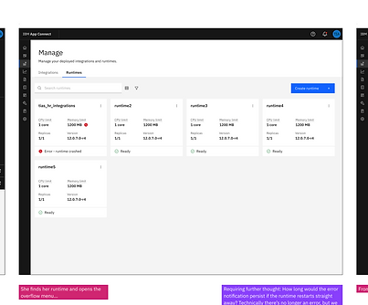
Runtime/integration warnings on the “Manage” page
To support in-context issue detection and reduce the need to visit a dedicated dashboard, we surfaced warning indicators directly on the tiles for runtimes and integrations. This was crucial for users like Isaac, who often engage with assets via APIs or management views rather than the dashboard itself. This change helped ensure that error insights were visible in the natural flow of their work.
The UX for this was fairly simple (A range of different statuses to indicate whether a runtime was passing various thresholds vs. actually erroring, displayed on the existing tile), but I also liaised with the content team to provide appropriate explainability as I needed to up their understanding of the requirements.
Successfully implemented.

Taking action directly from the log viewer
Given that Isaac often operates from the logs when resolving issues, we connected relevant error insights and suggested fixes directly into the log viewer interface. This enhancement made it easier to move from diagnosis to action without navigating across multiple screens.
I integrated the 'edit resources' button into a new design produced by our intern for the logs page which redirected to our brand new runtime experience (See Project 2). This was super simple UX updates.
Successfully implemented.

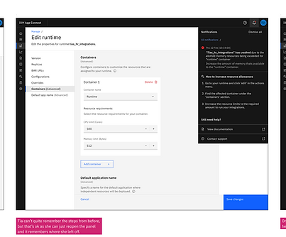
Notifications panel across the UI
This panel was fully designed to offer real-time alerts across the interface—making critical issues visible no matter where a user was working. It would have supported immediate action and fulfilled the earlier user need for homepage-level visibility.
However, due to uncertainty around how notifications would be handled at the platform level post-acquisition, this was paused to avoid wasted effort.
I had to go through several UX iterations largely due to scalability considerations. The fact that some users might have hundreds of errors meant I needed to push for some customisation of the Carbon component as it was then.

Errors widget (Dashboard and homepage)
This component was designed to be reused across the monitoring dashboard and homepage, giving users a quick view of recent issues when logging in. It aligned with early user feedback requesting immediate awareness of problems without hunting for them.
Despite its value, it was not implemented due to shifting priorities after the acquisition.
This required a few UX iterations to make sure I was displaying the right information in line with the 'choice paralysis' insight gained from testing; I made sure the information was clear and there was one primary action of 'take action now' vs. a secondary action of 'inspect problem further'.
Project feedback
Samples of some feedback received on my input on the project.
UX Designer, IBM App Connect SaaS
"I have observed how you worked with engineering to determine what is feasible and refined the UX for the 2023 MVP. You quickly build a very strong relationship between the design team and the squad that are delivering the designs. The squad are visibly keen to collaborate closely with design, regularly sharing feedback from an engineering perspective as well as to ensure they deliver to the exacting standards."
Product Manager, IBM App Connect SaaS
"I think you’ve done a really great job organizing the design work. This is a major net new item so there was a lot of figuring out to do as this isn’t as incremental as a lot of our other work so really appreciate how flexible you and the broader design team have been with it. I think the most recent playback was really helpful to see as it gave us a lot more clarity to be able to define the vision and will service us quite well for several phases."
Architect, IBM App Connect
"Really impressed with the way this work was approached to understand some of the technical aspects, get insights from team and user studies. The playbacks were great, and I know that the engineering team really got value from the involvement."